
Approach!
My basic approach was as a customer, not a web designer. As a customer what I need to know, what I want to see, and what I want to feel from the experience. The lack of web designing experience turned a great help to have a clear customer perspective.
Research
Before starting, many Indian and International e-commerce fashion websites are thoroughly checked in order to understand the global taste and trends and the difference between Indian and International design aspects.
As a customer, I would love to know 'WHAT BENEFIT' I am getting from this particular website. There are tons of websites at my finger tip, why should I stop by this one?.....
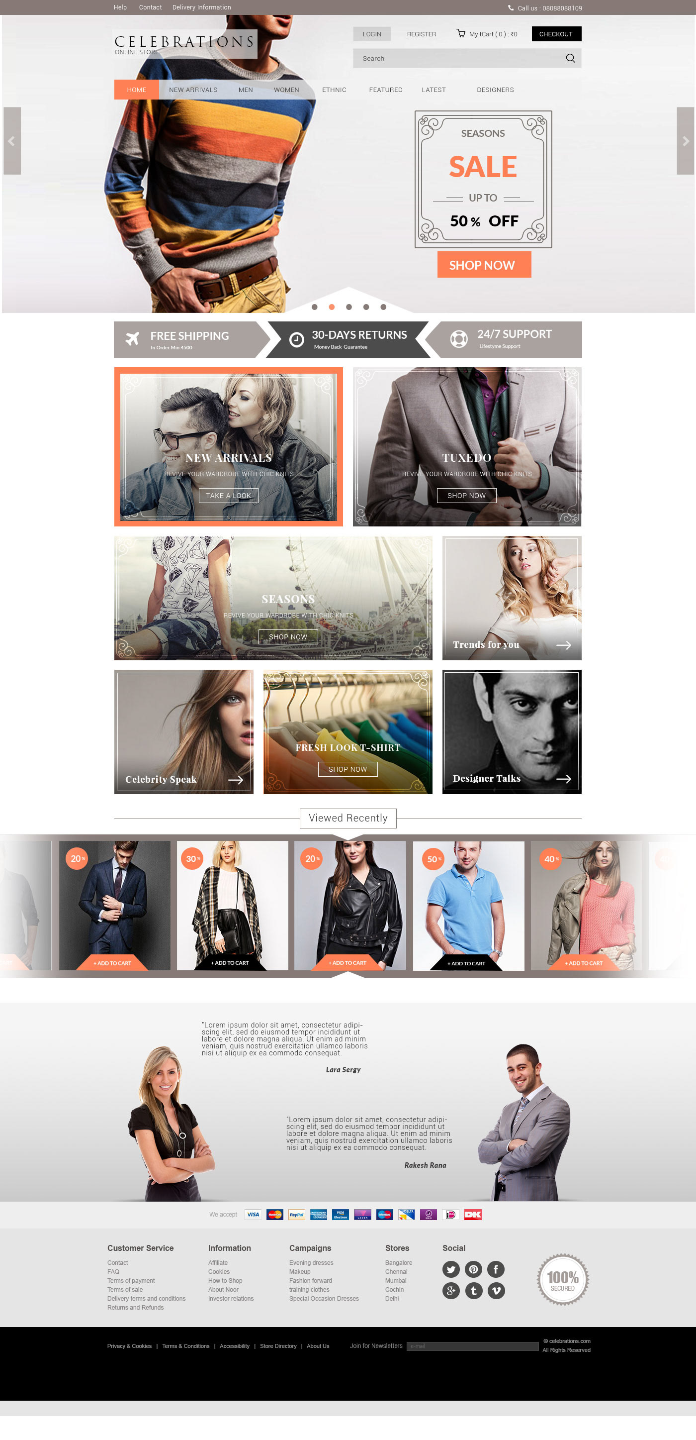
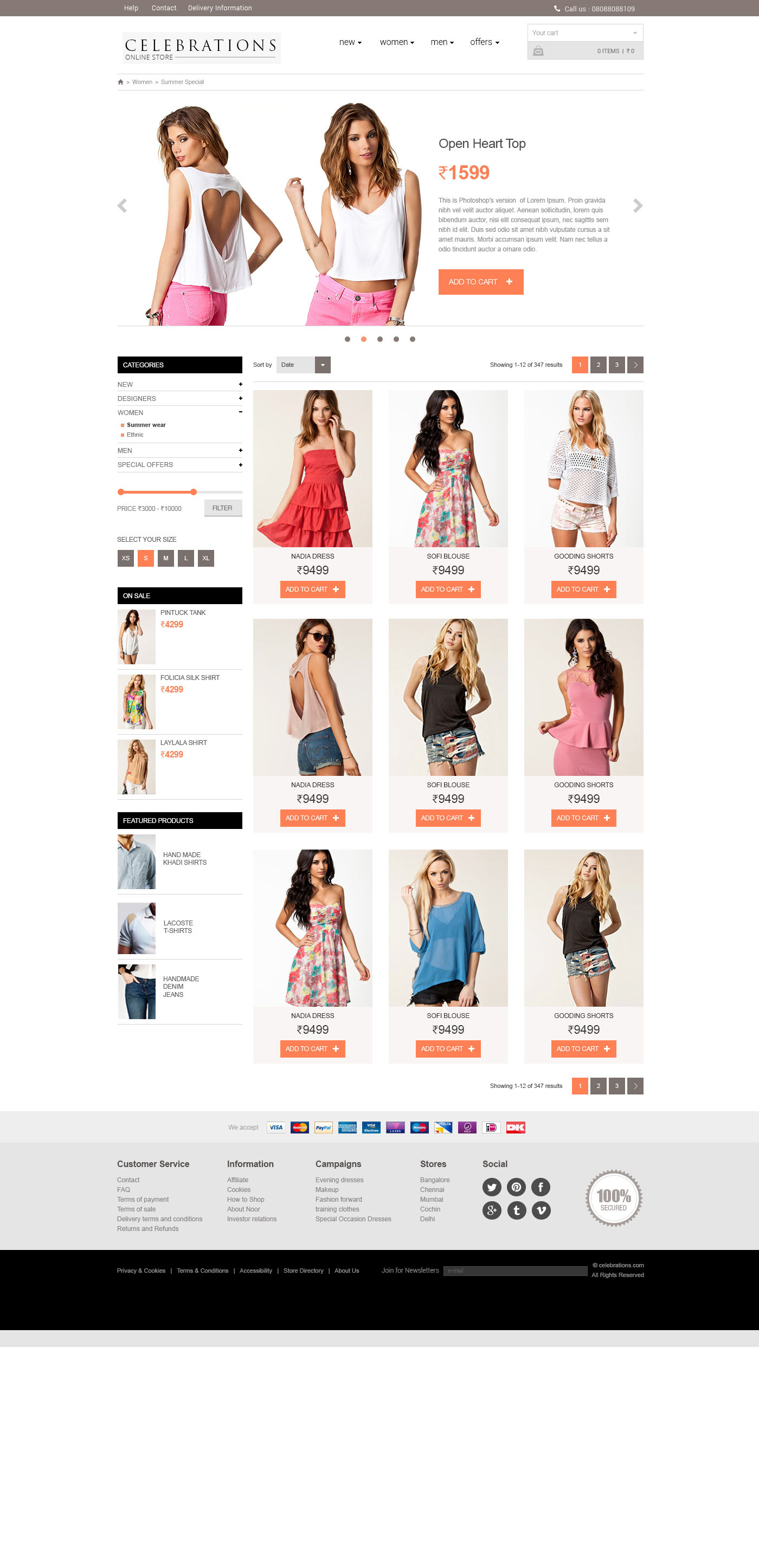
So, a design was finalised that is capable to 'highlight' all those aspects what a customer needs. Then the design was fine-tuned with proper colour theme selection and font selection to increase the appeal and give soothing feeling to the customer's eyes (we want him to stick on our site as long as possible)
Colours
Before deciding on the colour theme, a good research was done on the 'Psychology of the colours' and how each colour influences the user experience. The basic criteria to choose the colour theme was, to provide the best visual experience without losing the importance of the products. The customer is here to see the exact colour and texture of the products and overwhelming usage of vibrant colours on the page will kill that purpose. I decided to go with minimal colour swatches and avoided those colours that make a negative impact on potential buyers.
A low saturated dark brown and black colours had been chosen as the primary base colours and a medium saturated orange colour was selected for highlightings.
Fonts
Fonts play a crucial role in the user experience. it should match with the colour theme and the purpose of the site well, else will do a totally negative remark.
